CoverMyMeds Campus Update: A Sneak Peek At Our Workspace – Part Two
In part two of our sneak peek inside the workspace of our Franklinton campus, learn how we'll make the space look and feel like home through flexible and sustainable finishing touches.

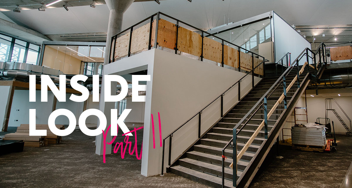
In the last installment of our campus update series, we took you inside our Franklinton campus for the first time for a sneak peek at our workspace. From meeting and collaboration rooms to the amenities designed to meet each employee's unique working style, we highlighted features that make CoverMyMeds a best place to work and grow. In the second part of this sneak peek, we look at the finishing touches — like furniture and fixtures — that will make our campus feel like home.
From the early days of our campus project, we’ve prioritized sustainability, wellness and flexibility in nearly every detail. As we march closer to move-in, those factors are even more prominent in the finishing touches. Empty rooms are transforming into functional space as we add tables, chairs, desks, couches, locally-sourced art and quirky accessories that’ll make this space undeniably ours.
To learn more, we chatted with Anna Sommers, director of campus operations, and Seth Colburn, environments coordinator. The conversation has been edited for space and clarity.
What’s the approach when taking our campus from a blank canvas to a finished environment?
Anna Sommers: In one word: flexibility. It’s important to CoverMyMeds — both in terms of our culture and our business. Flexibility is what helps us to innovate and try new things, so it’s important that we incorporated this trait into the design our environment (Editor’s note: check out this article to see just a few of the many ways we’ve incorporated flexibility into the design of our campus). We intentionally chose finishing touches that allow us to optimize space as we continue to grow. A few examples can be found in a few of our meeting rooms. Collapsible tables can be added or removed to convert an area in real-time. Movable walls can be opened to nearby office area to engage a larger group.
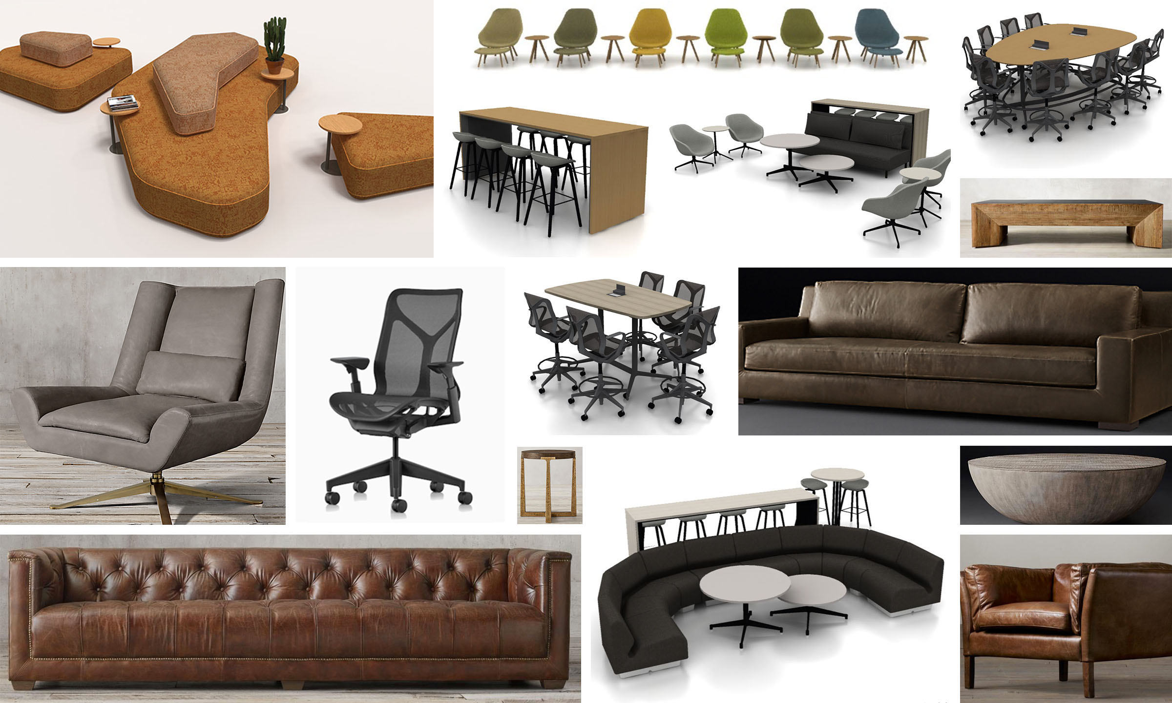
Seth Colburn: To that point, it’s important we choose furniture that’s durable, yet not out of the typical cubicle catalogue. Standard office furniture simply doesn’t fit our needs. We discovered that Herman Miller and Restoration Hardware offer commercial grade furniture that’s comfortable and matches our vibe. These pieces pair warm textiles with natural oak tones and metallics like pewter and brass. Others are more colorful in hues of green, blue, yellow and orange. We also tried to mix the type of furniture in a given space by creating tiers. High tops, bar-height console tables and stools contrast with sofas. Some chairs swivel, some roll and others are fixed. In the lobby, furniture is placed in shapes that nod to the cloud-like noise-absorbing panels that radiate light on the ceiling.

Our first campus building will contain 62 couches, 90 side/lounge chairs, 96 side/coffee tables and 11 privacy chairs. Furniture items that appear in the collage above are representative of our selections, but actual items may differ.
Anna: I like to think about selecting furniture for an office a bit like a game of Tetris. There’s all different shapes and sizes of individual pieces that come together to form cohesive spaces throughout our campus. This variety means furniture can easily move around as teams grow and needs change. This is another example of flexibility in our campus that allows us to adapt and meet the needs of our employees — now and in the future.
Beyond function, can you explain the look and feel of furniture selected for campus?
Seth: Sure! We wanted items that feel soft and cozy. After all, we intend our campus to be a place our employees want to spend time in and enjoy themselves while here. There’s a ton of seating that allows our staff to be comfortable while collaborating — like living spaces in a home. Different areas serve different functions. We want our staff to be able to move around and find a spot that matches the task they need to accomplish and how they’re feeling.
Anna: Our Environments team has always worked hard to understand specific needs of individual teams — even before work started on our campus. This detailed knowledge allows us to intentionally tailor areas of campus to the individuals that will work there. Including the desired types and layout of furniture in a work area to accommodate how departments function best is an important operational consideration for the business. I led the execution of similar concepts in my career and can attest to the benefits of providing our staff with diverse spaces to work in our campus.
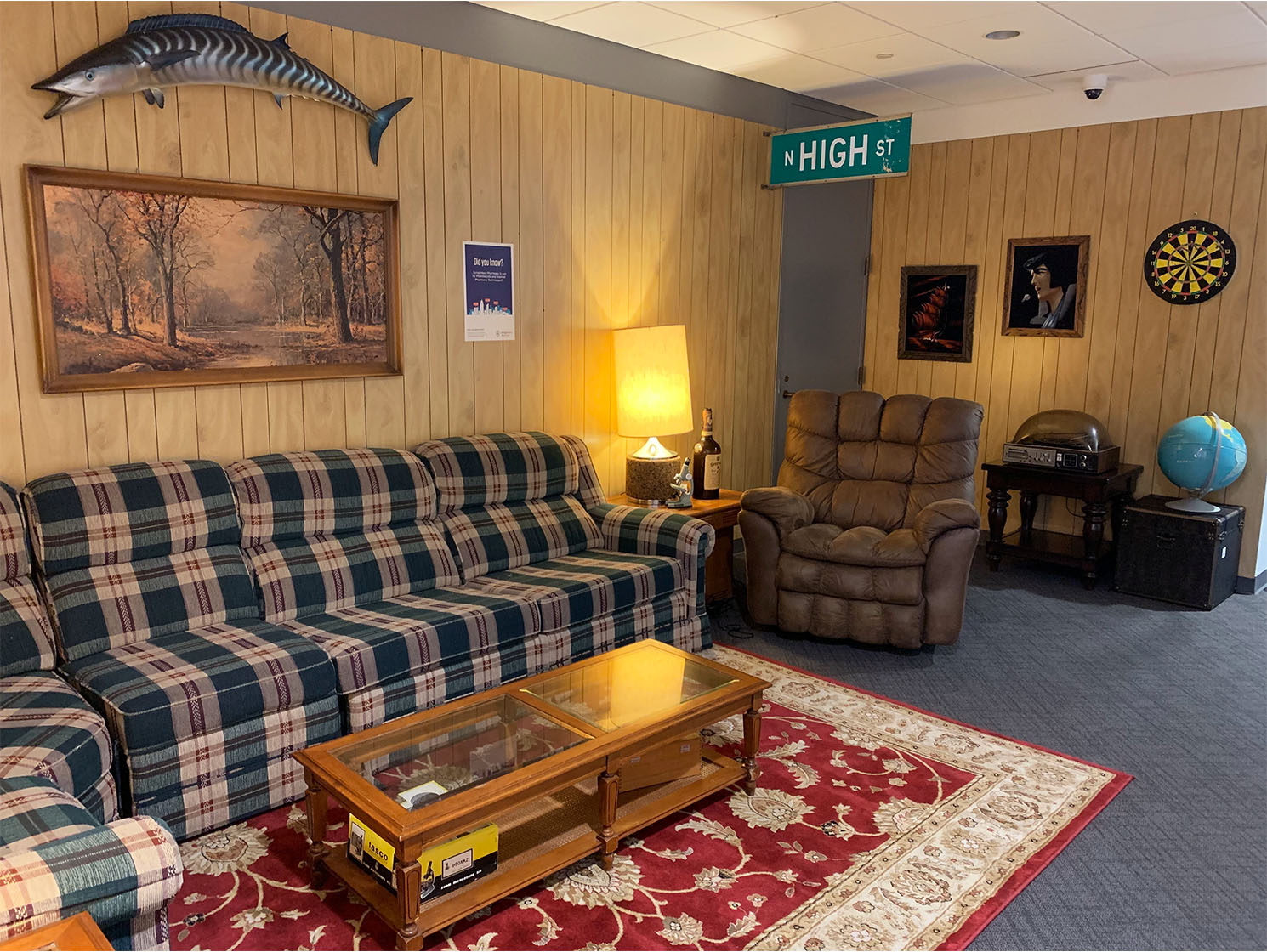
Seth: The furniture pieces we’ve curated will also give a distinct identity to flexible work spaces within the building. You’ll be able to tell what floor you’re on by the furnishings alone. One of the things I’m most excited about is going treasure hunting at thrift stores and antique malls for one-of-a-kind tchotchkes to accessorize our space. Additionally, our large collection of local art will be displayed throughout campus (including a massive art gallery wall in our lobby). Those details are what really make campus look and feel like home. For those who have visited our other office spaces before, think of interesting and cool spots like “Uncle Larry’s Basement.”

Anna: I was completely wowed the first time I stumbled across Uncle Larry’s Basement. You don’t see a lot of wood paneling these days! I can tell you the team is working on several equally impressive theme spaces for campus — but, I don’t want spoil any surprises. But I can share some other information with you. As a LEED Green Associate, I’m particularly excited about the reclaimed wood that a lot of the furniture we chose contains. Intentionally selecting this material aligns with CoverMyMeds’ interests in sustainability and our LEED certification. We’ve also made sure that textiles and synthetic leathers don’t contain toxins, which is important for our wellness efforts and our WELL certification.
Join us for a tour of the workspace inside our campus! Learn about the layout concept and see the collaboration spaces that allow us to continue innovating.
We can’t wait to call Franklinton home and are incredibly grateful to the community who has welcomed us in with open arms. Inspired by our core values which guide us to be selfless and do the right thing, we’re continuing our commitment of giving back in meaningful ways. We’re excited to be able to have an even greater positive impact as we move home.
Stay tuned for more updates on our campus project. In the meantime, catch up on previous updates and explore our plans by visiting our interactive website.
The latest healthcare insights, floated right to your inbox.


